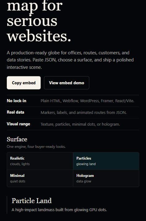
An interactive data globe works when the geography is part of the message. It should not be sold as "a 3D globe". It should be sold as a global data visualization component for websites, product pages, investor updates, dashboards, and editorial stories.
The goal is simple: help a visitor understand where something happens, how places connect, and which regions matter most.
Lazy interactive article embed
Let the article stay fast. Launch the WebGL globe when it adds value.
This is the smarter blog pattern: indexable explanation first, then an optional live scene with routes, columns, hover callouts, and terrain relief for mountain-style Earth visuals.
What an interactive data globe is good for
The strongest use cases are geographic, directional, or coverage-driven.
- Global office maps: headquarters, support hubs, partner offices, customer regions, or sales territory.
- Route visualizations: logistics lanes, flight paths, data-center traffic, payment corridors, API regions, or travel networks.
- Market coverage stories: country launches, availability zones, active markets, regional demand, or expansion progress.
- Editorial product reports: a launch recap, quarterly network report, infrastructure story, or public data story.
- Premium SaaS hero sections: a real interactive globe instead of a static stock world map.
If the data is local, table-heavy, or mostly numeric, use a chart. If the data is global and spatial, a globe can make the story faster to understand.
The data model should lead the design
A useful globe is not a background animation. It is a view over structured data.
The minimum model usually needs:
- Markers for places: offices, regions, airports, hubs, or customers.
- Routes for movement: shipments, requests, flights, payments, or handoffs.
- Columns for magnitude: demand, load, revenue, incident volume, or adoption.
- Annotations for explanation: callouts, KPIs, hover labels, and regional notes.
- Surface presets for tone: blueprint, orbital, hologram, particles, signal scan, realistic Earth, or terrain relief.
This is why the product page should talk about data visualization, not just WebGL.
Keep the default embed lean
The fastest pattern is a lightweight default scene.
Use a land-mask texture and dot-based surface for normal articles, documentation pages, and product sections. Load the heavier Earth texture and bump map only when the user chooses a realistic or mountain-relief style.
That gives you a better trade-off:
- the article stays indexable and fast
- WebGL is not required to understand the content
- the live globe loads only when it adds value
- optional terrain relief can still look premium when the globe is the hero
The live embed above follows that pattern. The article renders first. The WebGL scene starts only after the reader launches it.
Example: global operations map
For a company page, the globe can replace a generic "we are global" map with actual data:
- New York: qualified ARR
- London: pipeline health
- Berlin: partner density
- Singapore: expansion accounts
- Tokyo: enterprise market signal
Markers show presence. Columns show magnitude. Routes show movement between regions. Hover callouts explain what a point means without filling the page with labels.
Example: logistics and route storytelling
A logistics article can use the same component differently:
- Rotterdam to Dubai as a shipping corridor
- Dubai to Mumbai as a regional lane
- Mumbai to Shanghai as a manufacturing route
- Shanghai to Los Angeles as a transpacific route
The routes make direction visible. Columns can show volume or risk. Annotations can explain dwell time, disruption, or delivery status.
This is a much stronger story than a static screenshot because the reader can drag, inspect, and understand the network spatially.
Example: mountain and terrain mode
Terrain relief is not needed everywhere. It should be treated as an option for moments where the planet itself is part of the visual impact.
Good fits:
- a premium hero section
- a travel or aviation story
- climate, geography, or infrastructure content
- a launch page that wants a cinematic first impression
Poor fits:
- dense documentation
- list-heavy blog articles
- small inline embeds
- pages where the globe competes with product screenshots
The smart implementation is not "always realistic". It is lean by default, high-fidelity when intentional.
SEO keyword map without stuffing
The article can cover multiple search intents naturally:
- interactive data globe
- interactive 3D globe for website
- WebGL globe embed
- Three.js globe with routes
- 3D world map with markers
- global data visualization
- route visualization globe
- React globe component
- JSON globe markers
- data storytelling map
Use the primary phrase in the title, intro, image alt text, and product link. Use related terms in section headings and examples. Do not repeat the same phrase unnaturally.
Recommended implementation pattern
In a Next.js or React site, keep the content server-rendered and lazy-load the live globe component.
import dynamic from "next/dynamic";
import { useState } from "react";

const GlobeLivePanel = dynamic(
  () =>
    import("@/app/interactive-3d-globe/InteractiveGlobeShowcase").then(
      (module) => module.GlobeLivePanel,
    ),
  { ssr: false },
);

export function ArticleGlobeDemo() {
  const [isLive, setIsLive] = useState(false);

  return isLive ? (
    <GlobeLivePanel compact />
  ) : (
    <button onClick={() => setIsLive(true)}>
      Launch live globe
    </button>
  );
}
For product pages, the live globe can be above the fold. For blog posts, load it on demand.
Where to buy or inspect the kit
The product page is the best place to see the live implementation and integration options: Interactive Data Globe Embed Kit.
You can also inspect the public code direction on GitHub, or buy the kit through the checkout link.
The core positioning is: a global data globe kit for teams that need a premium, interactive, reusable way to explain where their product operates and how their data moves.